The tool for sports enthusiasts who want to connect with their local community.
Client
Year
2018
Role
- Product Designer
Deliverables
-
User research
- Personas
-
IA
-
User flows
- Paper & digital prototyping
-
Wireframes
-
Design
Problem
It’s difficult to organize sports activities and find enough people to create a full team. The community lacks a tool that connects people to build comradery through healthy lifestyles.
Are people interested in connecting with their local sports teams?
To determine if our app would be successful with our target audience, I started by creating an interview plan. I screened individuals who played, coached, or taught sports, and then developed talking points and questions for a testing script.
- Obtained positive feedback and engagement
- Social influence and connecting with like-minded individuals were powerful motivating factors
- People often use Facebook groups, MeetUp, and UrbanRec to find teams, but are dissatisfied with them

How might we help people play on sports teams more easily?
Create a tool for sports enthusiasts who want to connect with others in their community. The goal is to make it easy for people to create or join a team within their location, and to connect them with recreational activities in their area. This will help build a closer sense of community.
What features are desired by members?
- Options for competitive vs casual
- The need for a similar skill level
- Ability to track attendance and game history
- Ability to share game photos
- Show more descriptions
- Tagging people feature

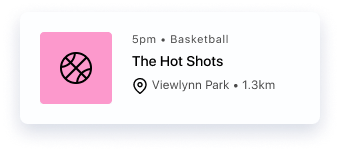
Team creators and members are the target audience for this tool.
The research shows that people have five main needs: physiological, safety, social (love and belonging), esteem, and self-actualization. One important insight is the social motivation, which can be validated by the desire for apps such as Strava, RunKeeper, and Nike Club that use social networks to motivate users. This approach builds on existing support networks and takes advantage of social influence and peer pressure to drive effective behavior change. Two user types emerged from the surveys: team creators and team members.
Information Architecture
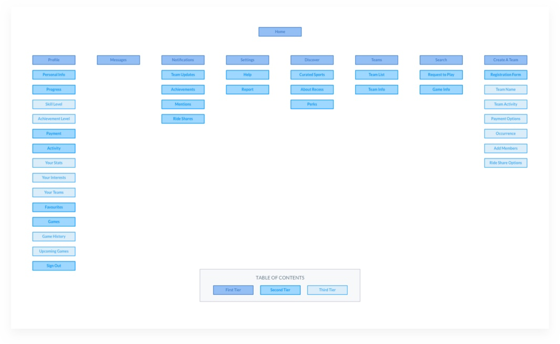
After outlining the user types, an information architecture map was created. Participants were asked to do a card sorting exercise using the tool Optimal Workshop, which was easy to use and could be done remotely. The results of the exercise guided the creation of menu structures and navigation paths.
User flows
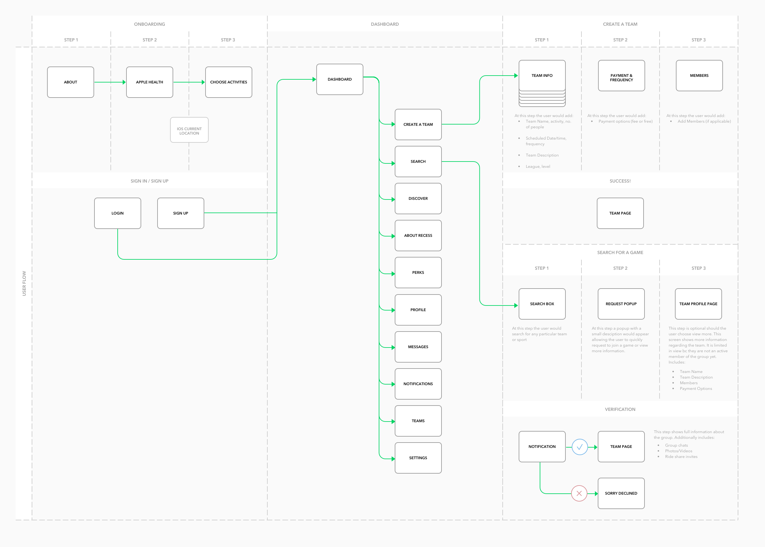
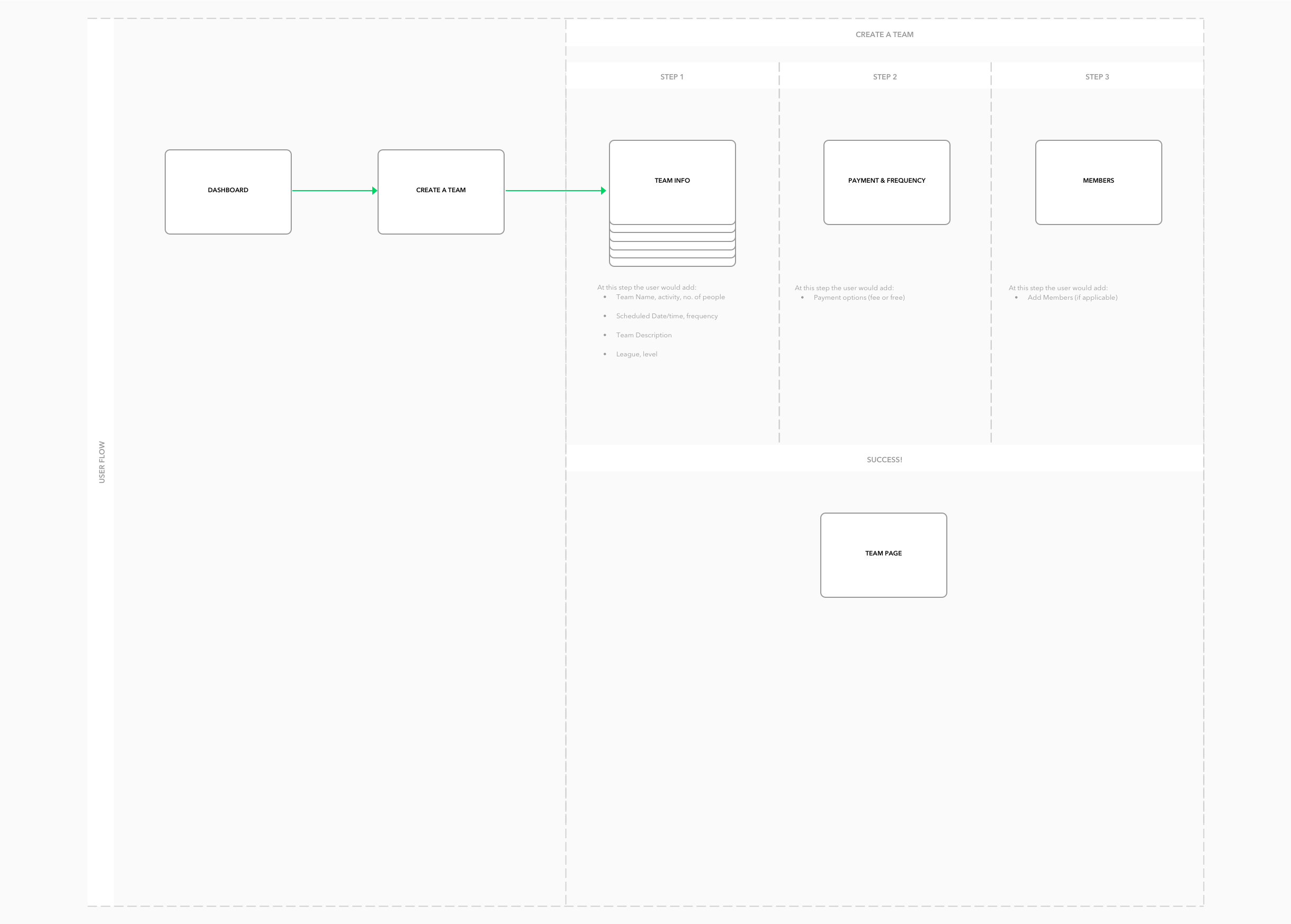
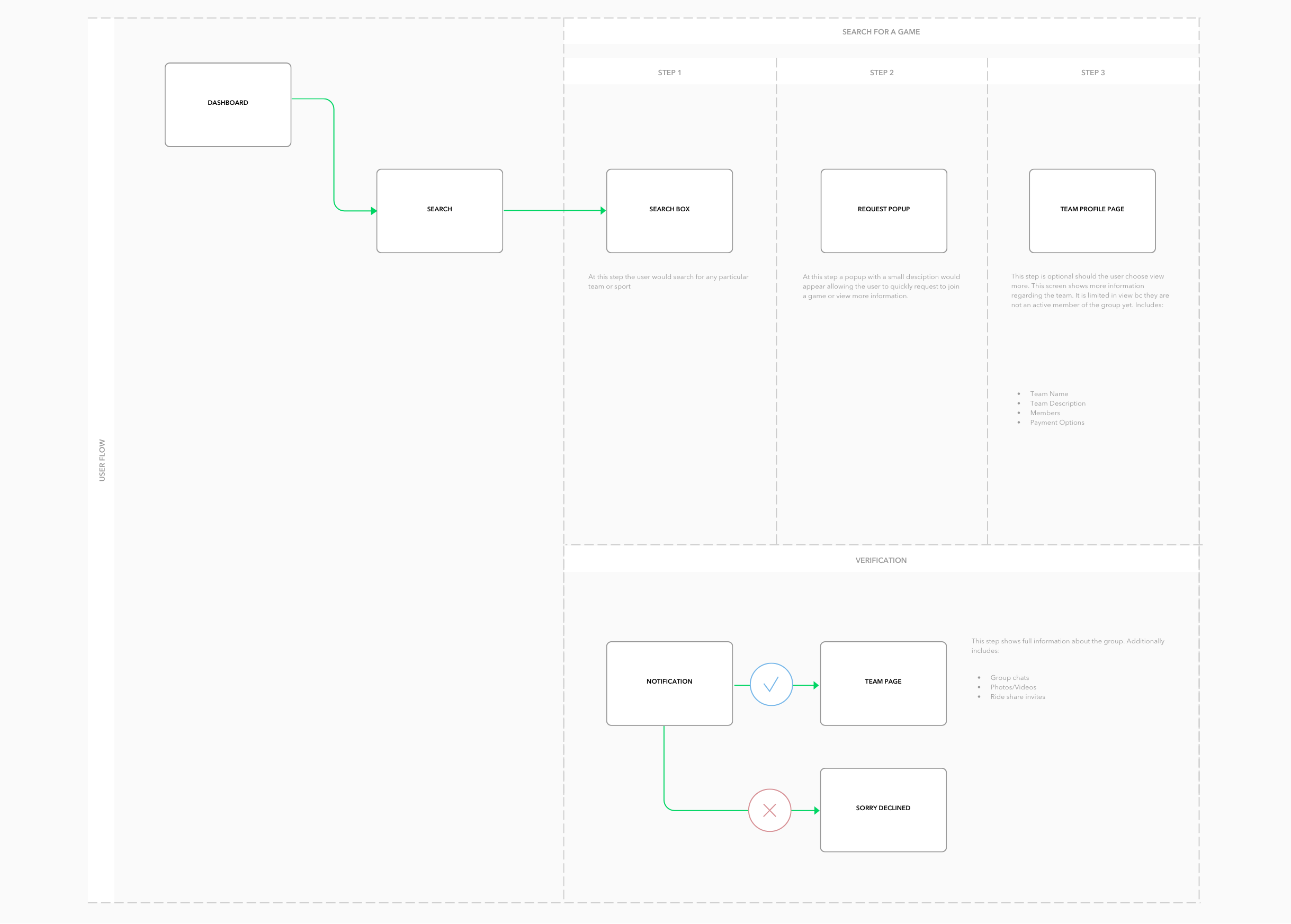
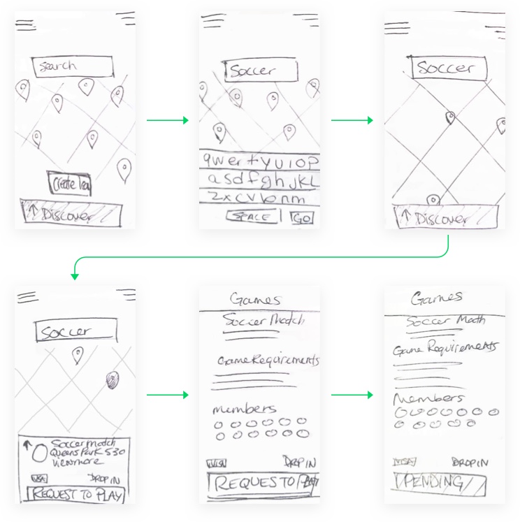
I have identified two main tasks that lead to the main purpose of the app. Task One: Think of a sport you would like to play. How would you search for and join a team? Task Two: You are on a team and need two extra players. How would you create the team?
Sketch Prototype
Next, I used Marvel’s POP app to test the basic flow to join a team using a paper prototype. It was a great tool to gather feedback from user’s. A few highlights included:
-
Adding a filter to the dashboard
-
Including competition level in the pop-up
-
Showing which friends are playing
Wireframe Prototype
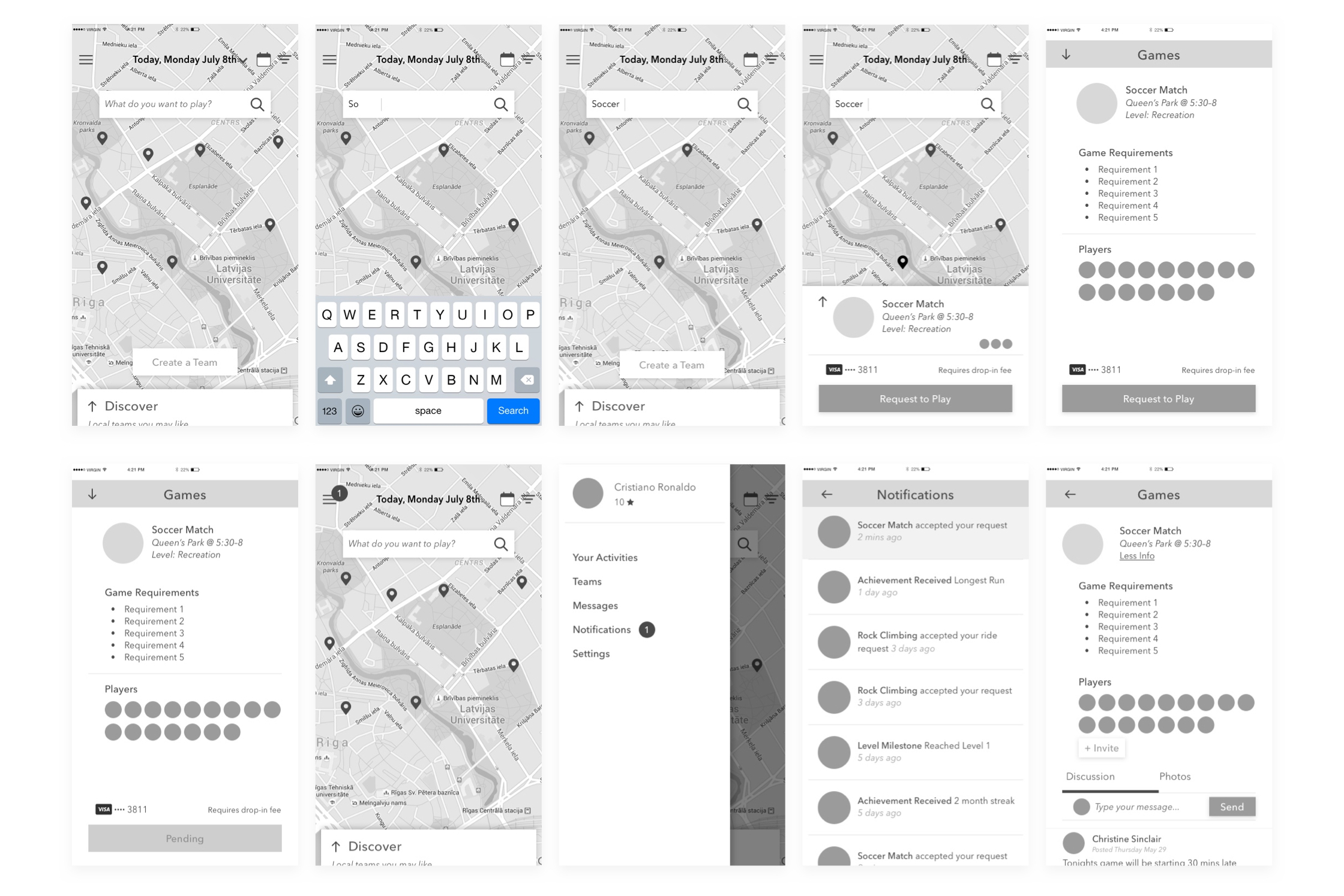
After receiving feedback, I iterated on wireframing for layout and functionality. My usability test sessions went much more smoothly and everyone was able to complete the task with no problems.
Design exploration
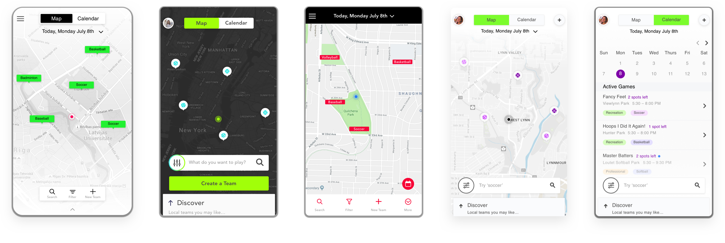
I explored designing multiple options for a friendly and fun interface. I worked on three different iterations of style and approached five different usability test participants. I documented the feedback and reflected on them in the last round of adjustments.
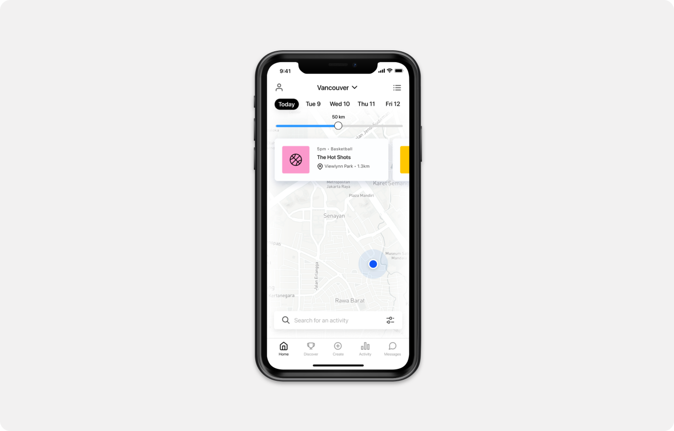
For instance, Lyft recently wrote an article on the findings they received from testing the search bar at the bottom of their mobile application’s screen. Although a bit unconventional, the feedback showed that it was easier to use and more preferred by users.
Final Designs
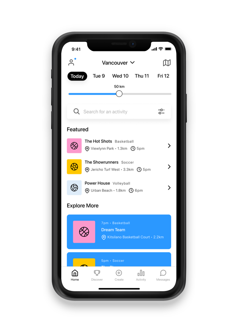
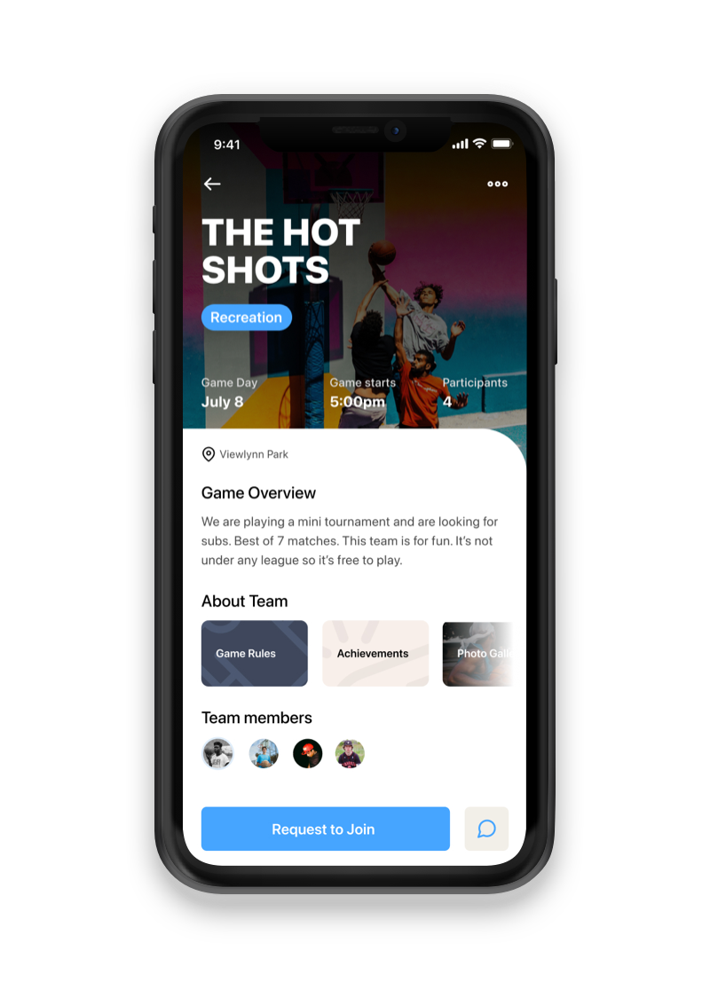
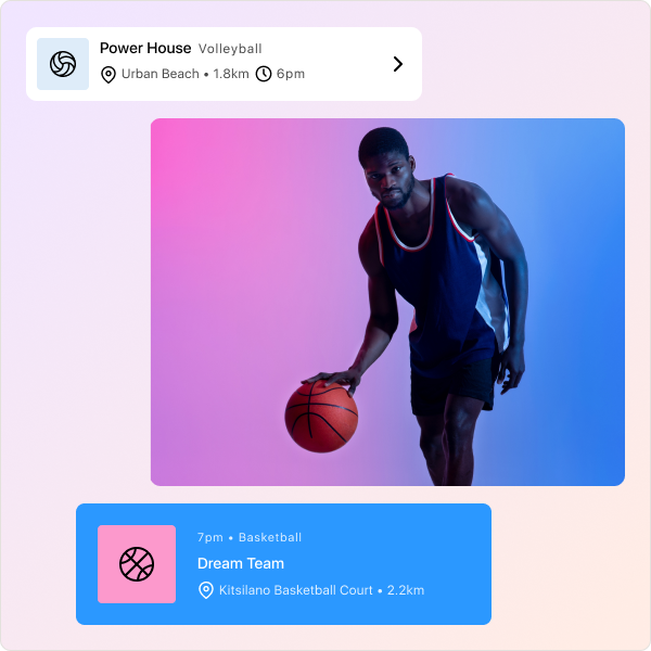
After receiving feedback and iterating designs, here are the final mocks. The list view now highlights featured events tailored to users based on their onboarding experience, making it easier for them to find relevant events.
As users join more teams, the content becomes more personalized through pairing, providing value even with increased use.
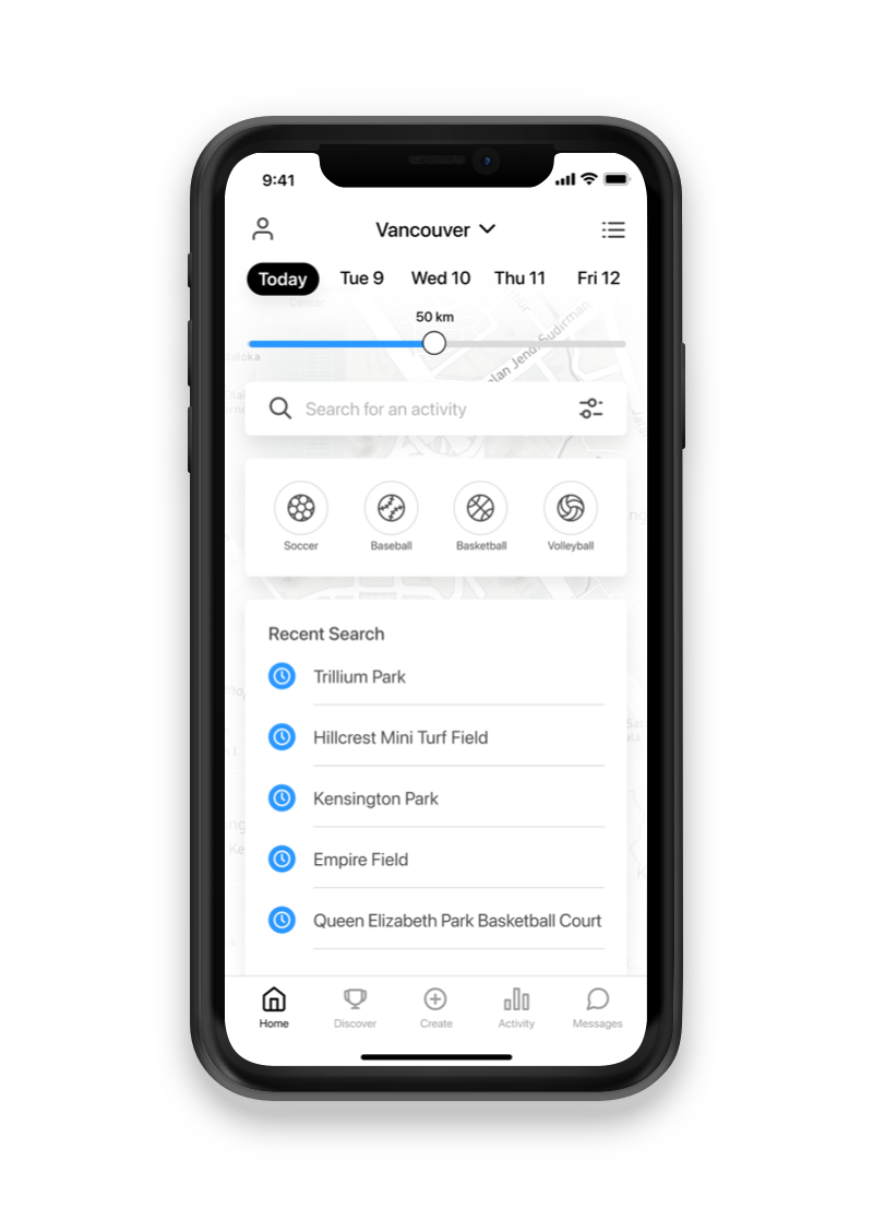
The search bar now has auto-complete and suggestions, and is moved to the top of the screen when tapped, allowing users to find their favorite teams and activities faster. Cards now have key details such as date, location, time, description, photos, team stats, rules, and member list. Users can expand a card to view more information, providing more details about events, teams, and activities.
Key learnings
- Getting the problem statement right is the first and crucial step
- Knowing when to use certain methods during my process was incredibly valuable.
- It was super insightful to receive rapid feedback and be able to apply it

