Helping share life’s important moments
We prioritize customer satisfaction by providing a high-quality e-commerce experience for all your photo products.
We prioritize customer satisfaction by providing a high-quality e-commerce experience for all your photo products.

2017
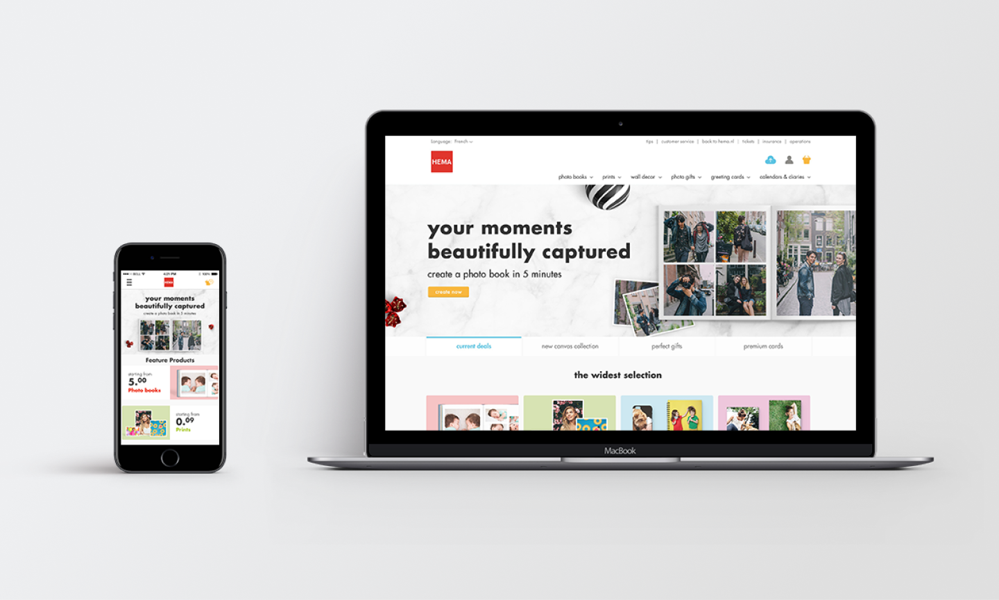
HEMA wanted to explore using our e-commerce platform to solve a technical problem. They felt their software was limiting and outdated.
There was a lot of ambiguity at the onset of this project. I collaborated with a product owner, art director, and UI designer to work through the uncertainty. In order to achieve this, we took on the following tasks.

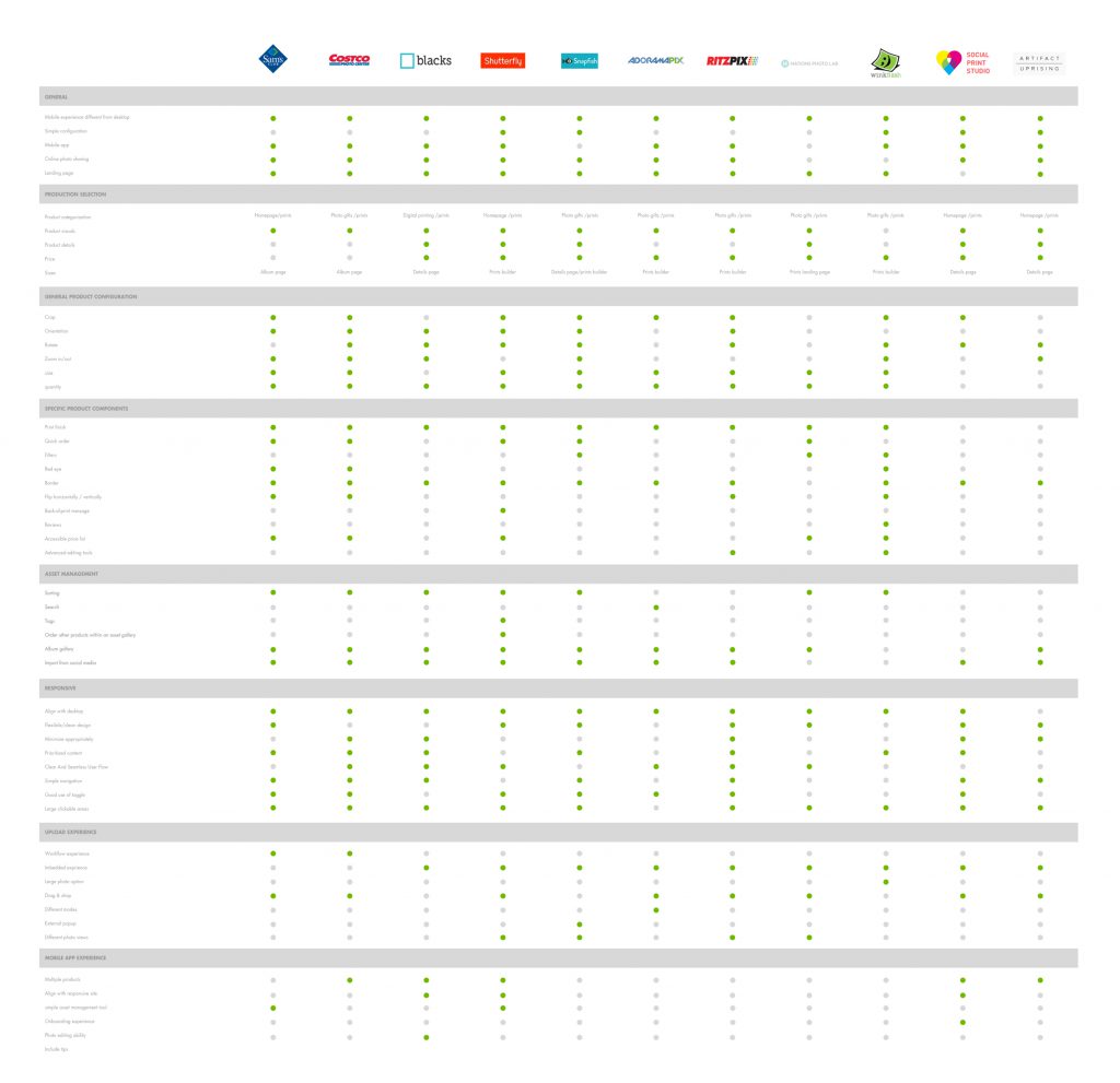
After identifying sections needing attention, we prioritized improving the uploading experience, which was lacking across the board. We also discovered mobile respondents had less functionality, making them dependent on desktop.
Working with our user researcher, I discovered user behaviors for print discovery and creation. I identified areas for improvement by using feedback from our user researcher and my own experience with the builder.


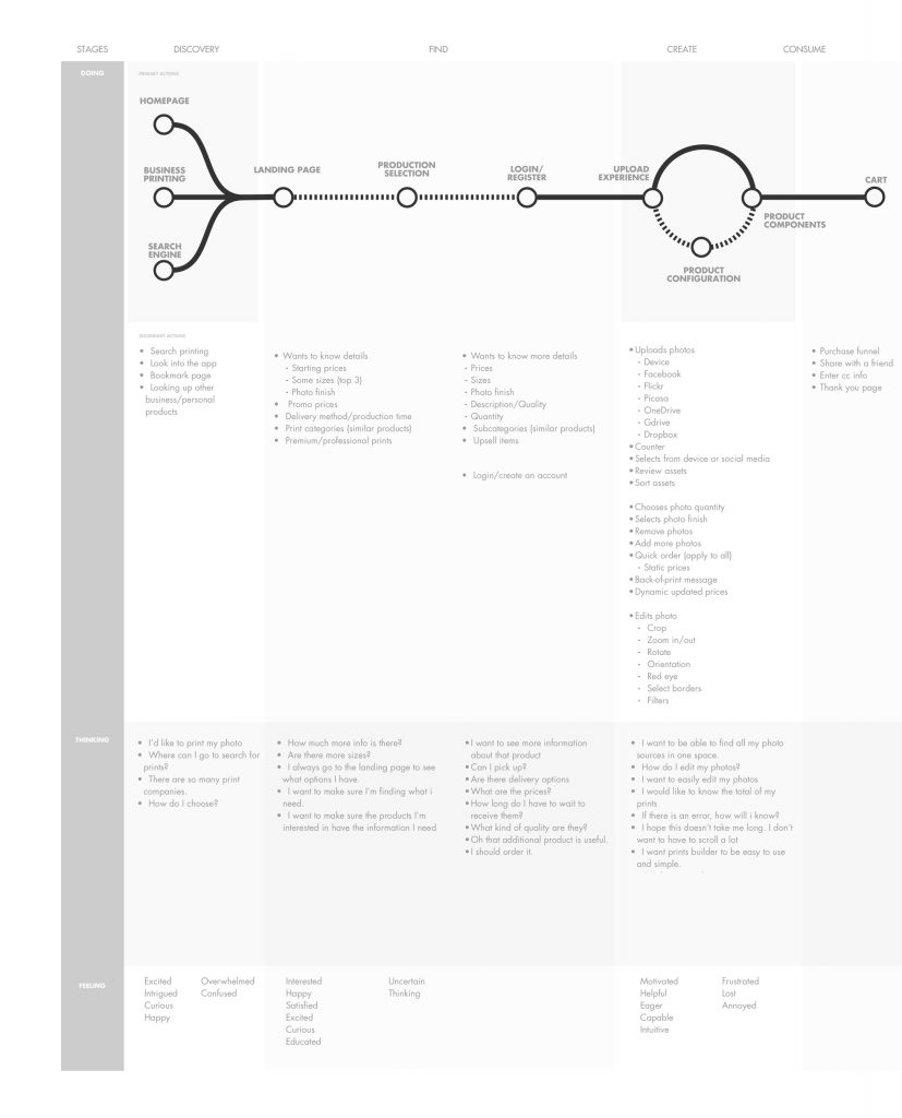
Further analysis revealed insights into the photo book creation experience. Creating a customer journey map helped highlight problems. We identified and prioritized key areas for improvement, including theme selection, image upload, and tool selection. These areas caused frustration and wasted time due to inefficiencies.
Our software makes photo books quickly, effortlessly, and calmly, so our customers don’t have to spend hours on them. So we decided to retheme only the home page and SKU page since the existing framework for the marketing site was successful with our other photo sites.
The client was impressed with the redesign prototype containing animations but couldn’t work due to legal issues with European company. Though this was unfortunate timing, the validation from our client was encouraging.
Despite the setback, the project taught me valuable lessons in design best practices and creating better forms for both web and mobile. I created a scalable library of shared components in Sketch.
