A platform with benefits
We help brokers easily build self-funded programs, get competitive stop-loss quotes, and deliver cost-saving solutions to your clients.
We help brokers easily build self-funded programs, get competitive stop-loss quotes, and deliver cost-saving solutions to your clients.
2019
Our clients had difficulty navigating the site to review and analyze the results of their healthcare plans. Educating our audience extensively presented many challenges to our internal staff.
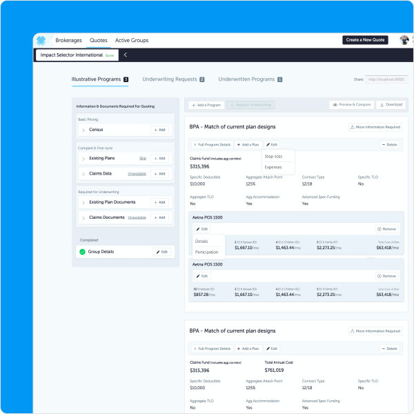
Our internal staff provided us with valuable insights that they received directly from our customers.
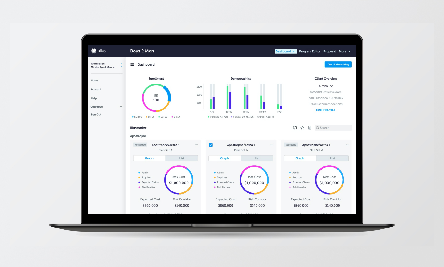
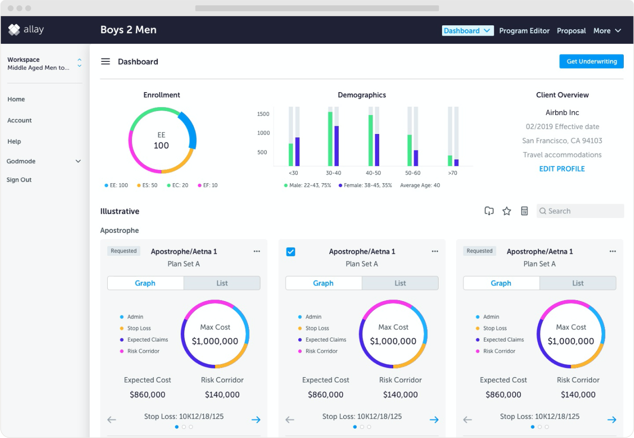
Brokers will use a digital enrollment process to track employee progress, choose from vetted vendors, get preferred vendor rates, and collect digital signatures for policy documents. Allay forged smart alliances with strong carriers, agents, third party administrators (TPAs), and enrollers to provide the most value. The dashboard would represent a snapshot of key indicators and price comparisons. According to my research, these indicators include maximum and expected costs, risk corridor information, and stop loss information.
Providing a better user experience will significantly free up our staff’s time and enable more users to find cheaper and more efficient quotes faster.
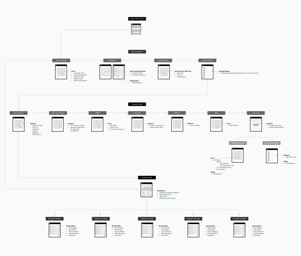
Through our user flow workshops, we gained a deeper understanding of healthcare challenges by investing time in understanding their workflows. The US healthcare system is incredibly complex, which made it difficult to provide a simplified solution. We identified touchpoints, individuals involved, and areas for improvement. However, due to the early stage of our project, we had to prioritize certain efforts that had to remain manual, such as excluding automated notifications and an internal messaging system.
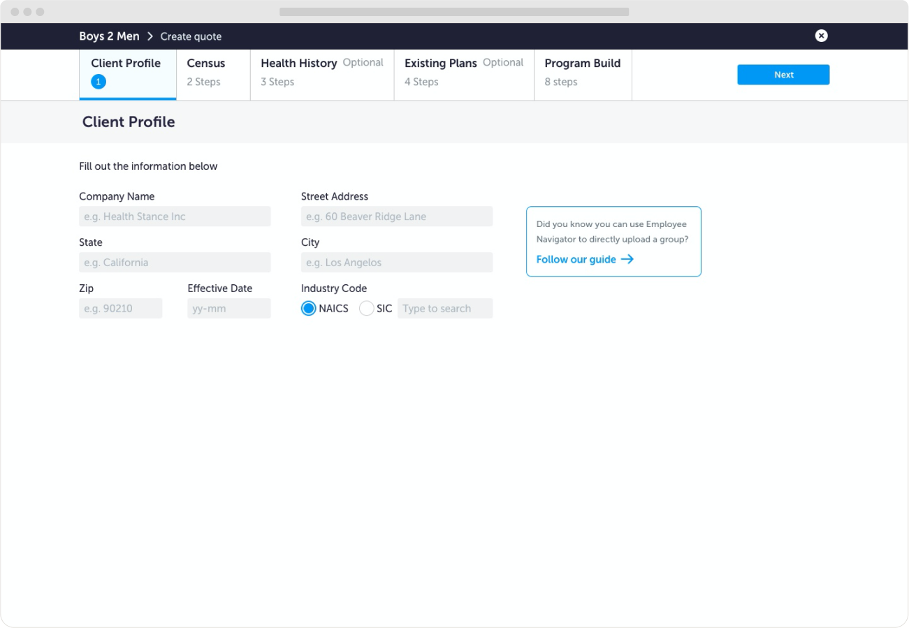
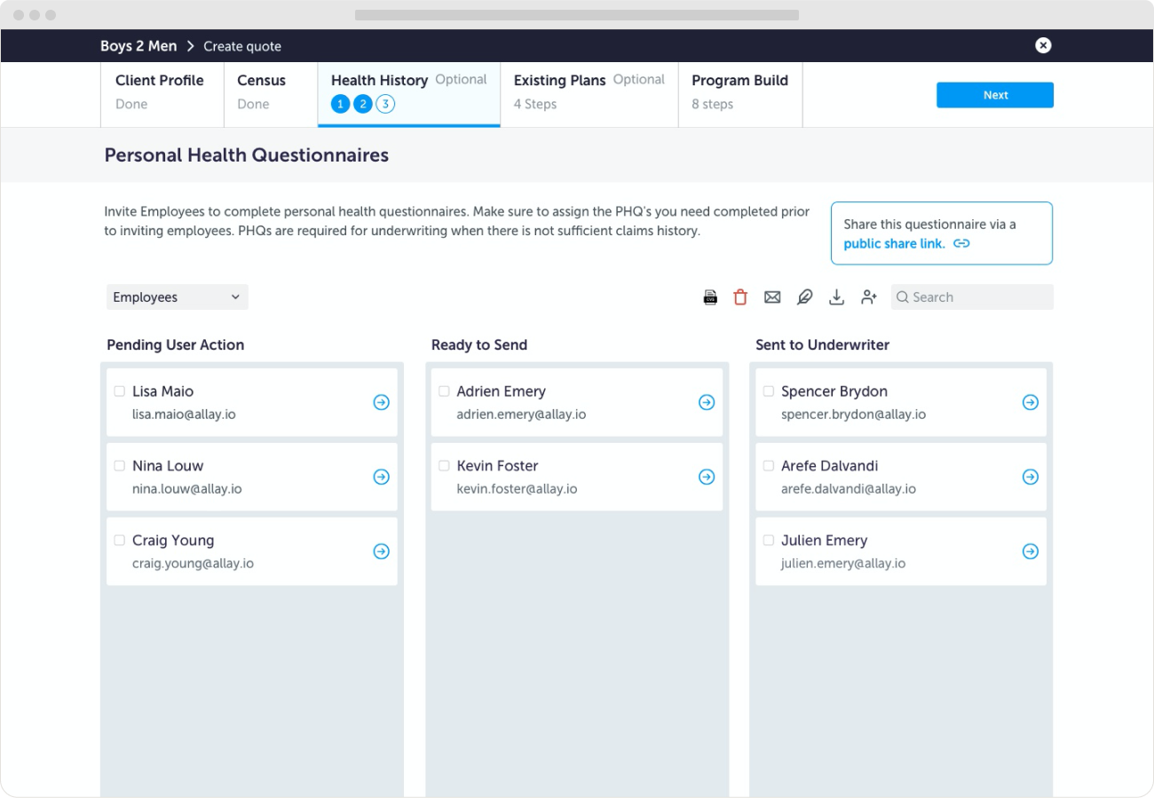
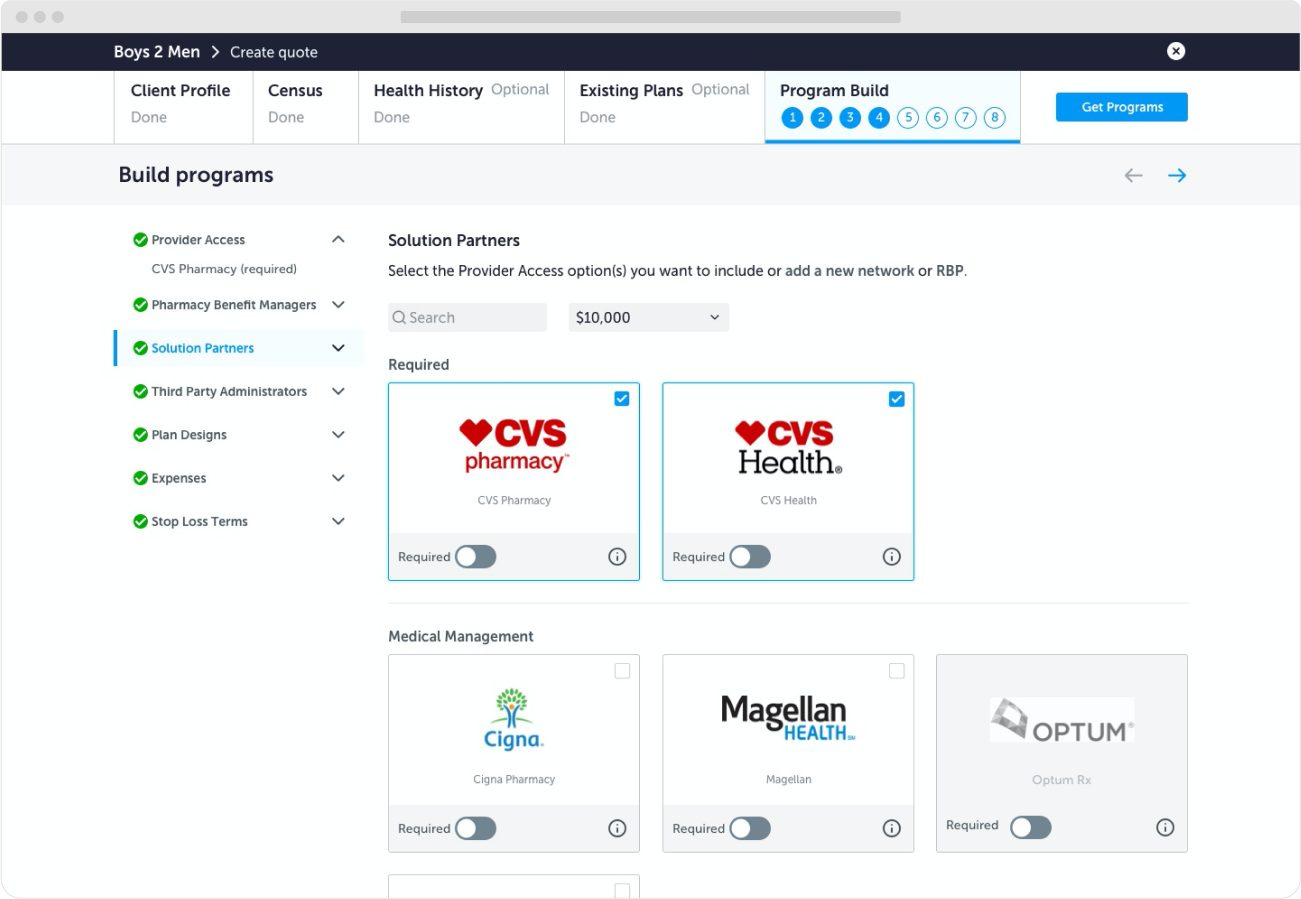
It starts with ensuring to capture all the information we will need from employees. Once the forms are completed, next the brokers are prompted to connect to top-tier vendors so they can select and filter through plan options. Then we display a dashboard that identifies potential cost-saving opportunities by comparing a member’s expected cost to their risk cost from Allay’s claims data and finds factors that help to explain potential differences.
During my time working on this project, here are some things I learned - both professionally and personally.
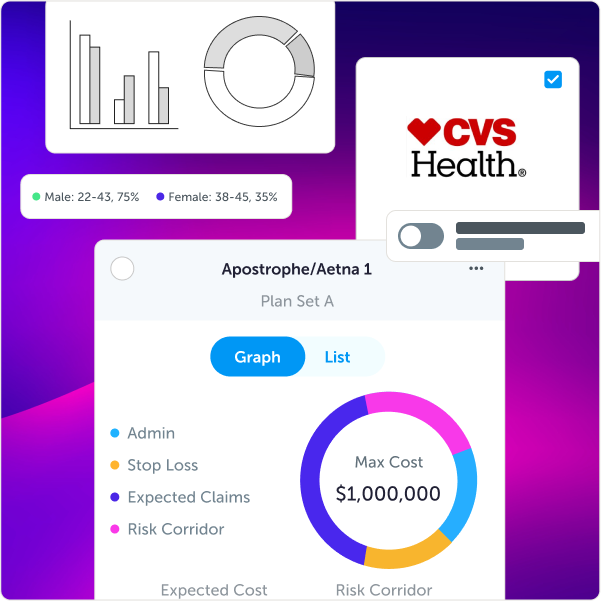
We successfully launched the enrollment experience!
Increased customer satisfaction and reduced churn
The tool got acquired by a large American insurance company
The team got acquired by a San Fransisco healthcare start up