Together, we move the world with powerful insights
We helped businesses’ content stand out whilst finding their perfect stock visuals more easily.
We helped businesses’ content stand out whilst finding their perfect stock visuals more easily.
2018
Our customers often find it challenging to select the appropriate visuals to capture their audience’s attention and motivate them to act.
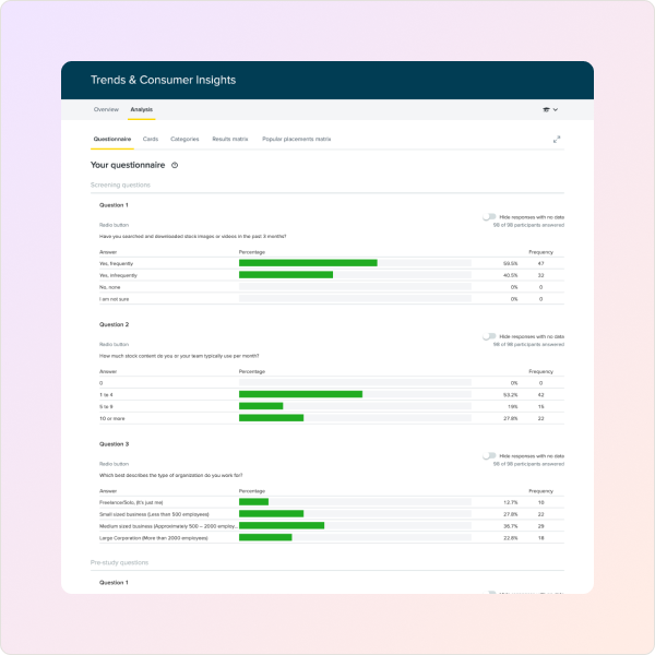
A survey was conducted with 82 participants based in the US and Canada.
We want to allow access to Getty Images engagement data. It will not only allow users to preview top-performing searches but will also give them access to data containing how often specific searches have been made over a certain period of time and region. This tool would be an extension of our research publishing platform Creative Insights.
Collect engagement data to validate whether it helps customers make better purchasing decisions. The longer-term business metric is to achieve 5 of total downloaders using the tool.
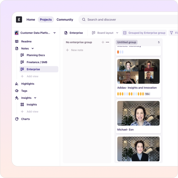
We interviewed Getty and iStock customers to gather information and better understand their needs and pain points regarding a data tool. We used Dovetail as our research repository to analyze feedback and present key insights to the team and stakeholders.
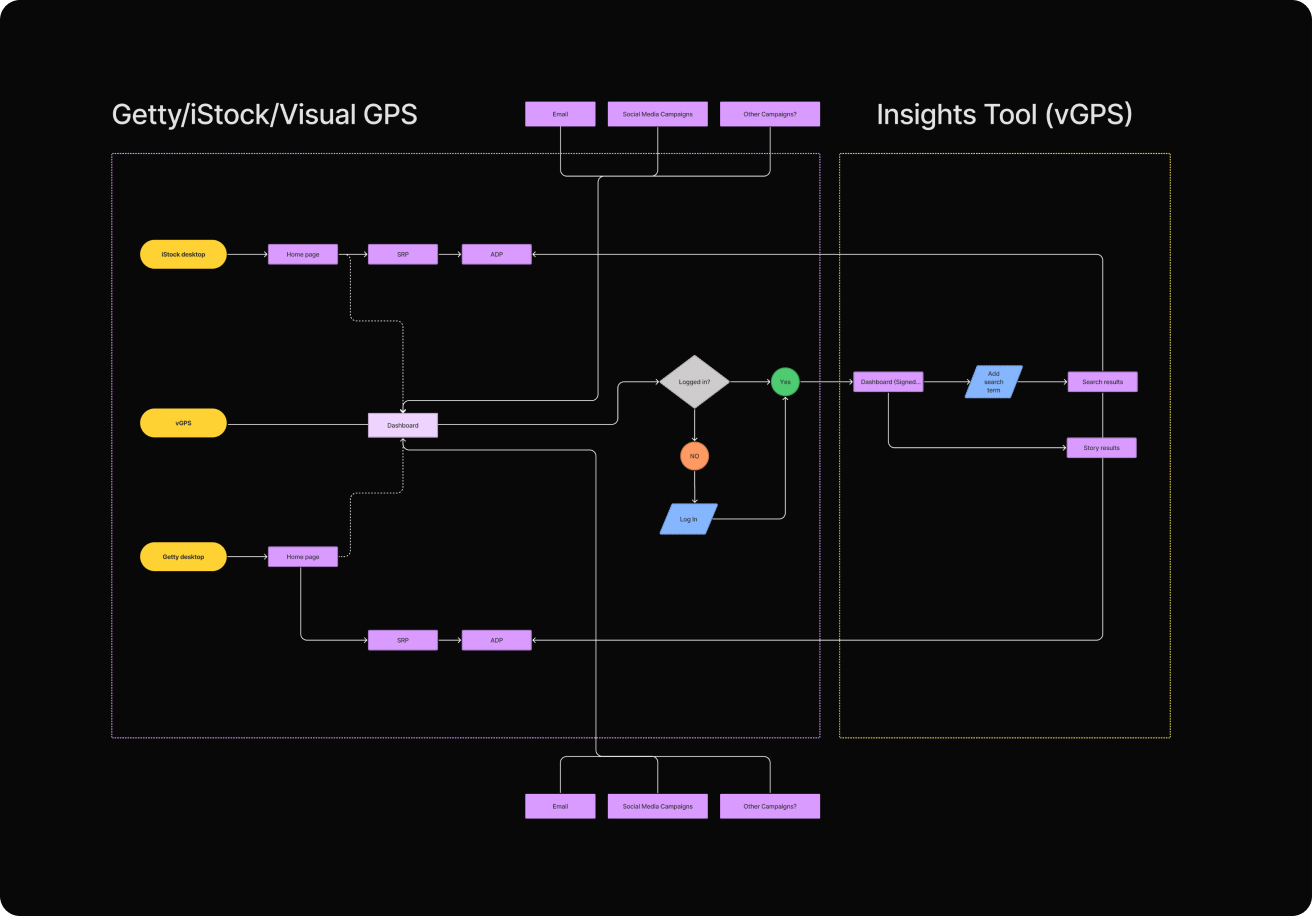
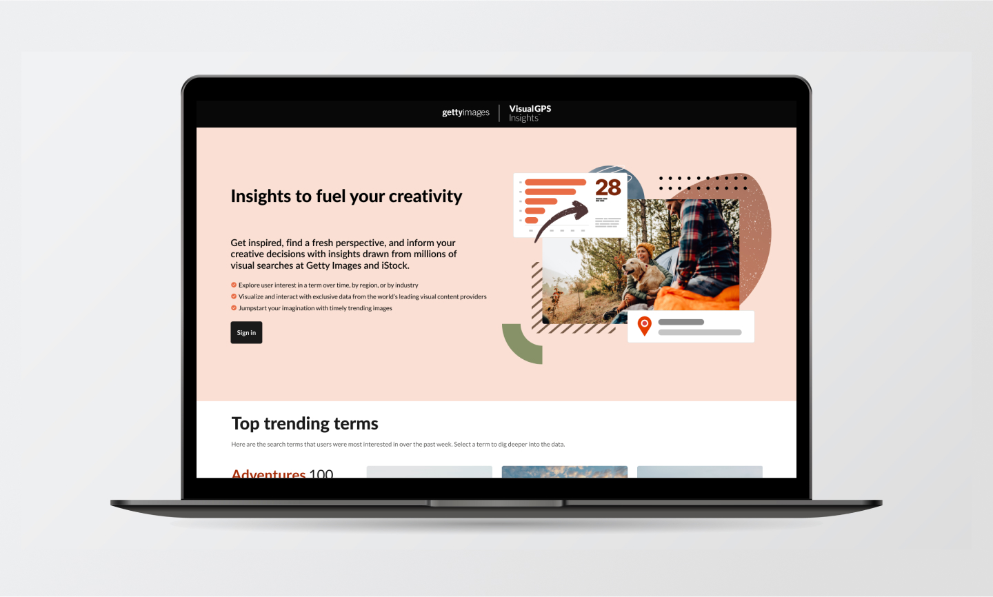
Our goal was to prove the validity of our hypothesis. We didn’t have complete investment from the executive level. Therefore, we were constrained by not having enough time or resources. Our key strategy was to test if people found value in using this tool. Given such a tight constraint, we only had enough time to create a landing page that would direct users to a results page.
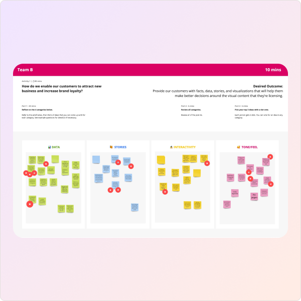
I co-led remote brainstorms for up to 16 people using Miro. We shared materials beforehand and set expectations for outcomes. We prepared documentation outlining the workshop goals, participants, and exercises, and gathered and synthesized ideas.
Our goal was to help users understand and use the platform by showcasing trending content with rich visuals. We aimed to educate, inspire curiosity, and provide opportunities to browse and discover through curated data stories. These stories were created using the Creative Insights publishing platform. The Visual GPS section focused on articles related to decision making and visual content that engages consumers today. The objectives for both the Visual GPS articles and insights tool were well-aligned. We assumed most Getty users were familiar with the brand.
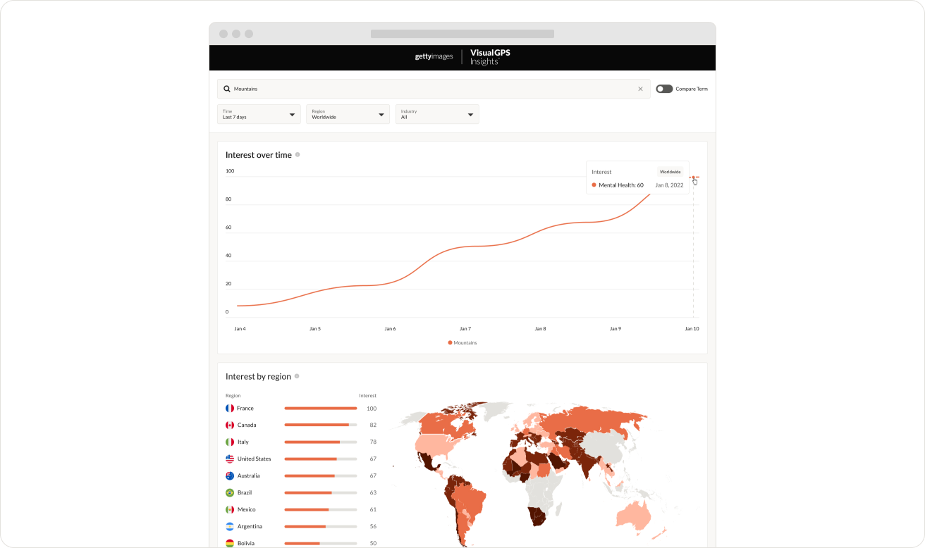
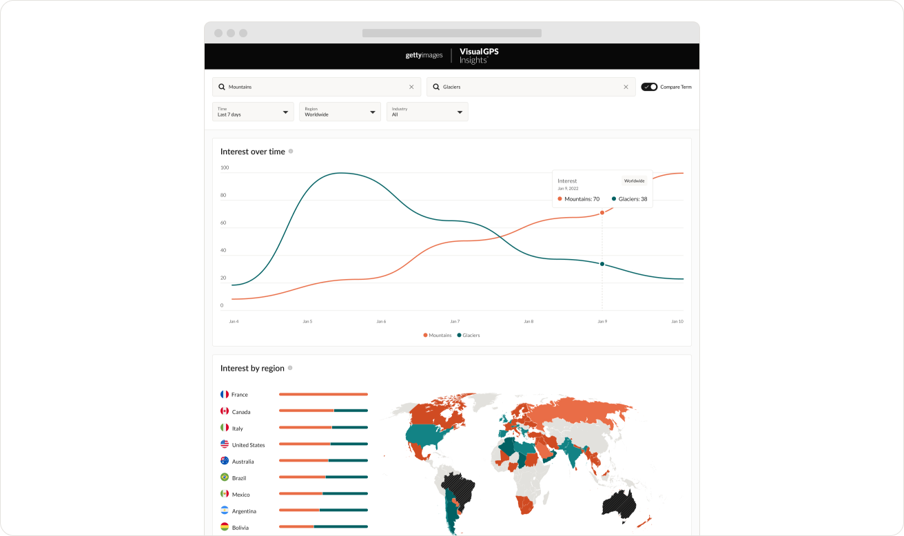
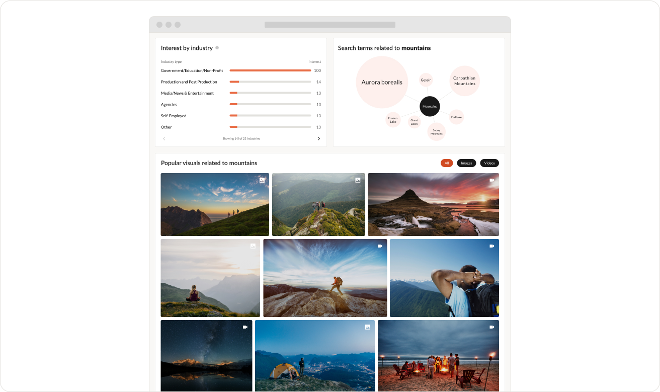
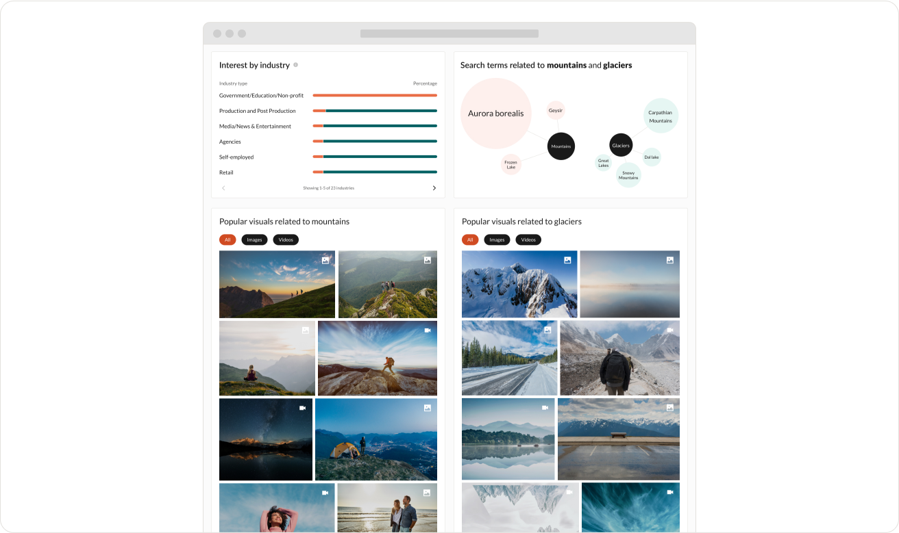
The results page allows customers to view real-time search and engagement data from various industries, globally and by region, to gain insights for their creative work. We will provide a line chart of interest over time, a global heat map of regional interest, a bar chart of industry interest, and top visuals (illustrations, video, stills) that update based on global, regional, time, and industry selections.
I lead the creation of the design system. I was responsible for enforcing visual consistency and maintaining high-quality standards across the platform. It was a tool that empowered the team and helped drive a unified experience. All components and documentation were built from scratch, which resulted in reduced design churn and better alignment with the front-end team.
We did usability studies to see what was working, what needed improvement, and where to focus investments. Our goal was to understand how well the platform met users' needs.
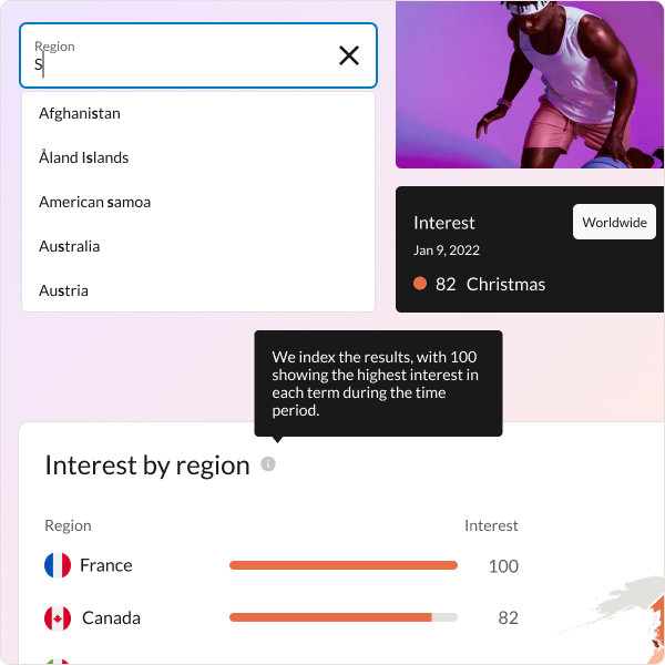
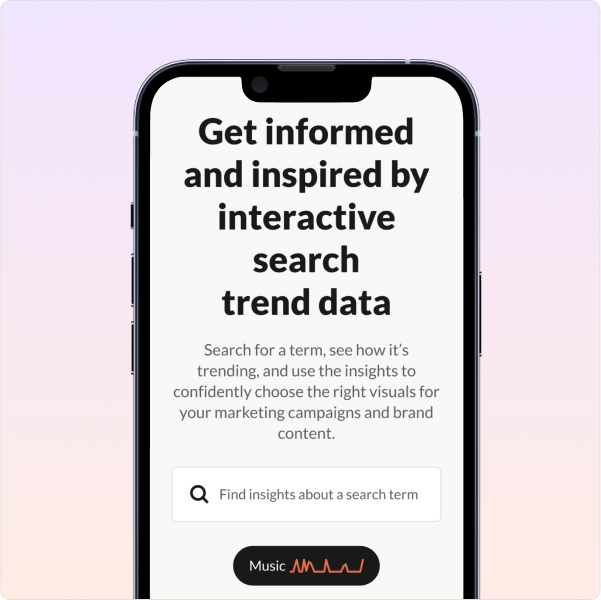
This product was released in May of 2022 in english only, then followed by all other localized regions. Since the launch, we made a few adjustments and added some features to improve the experience. The numbers below show an increase in usage rate over the past 6 months.